Brand Identity.
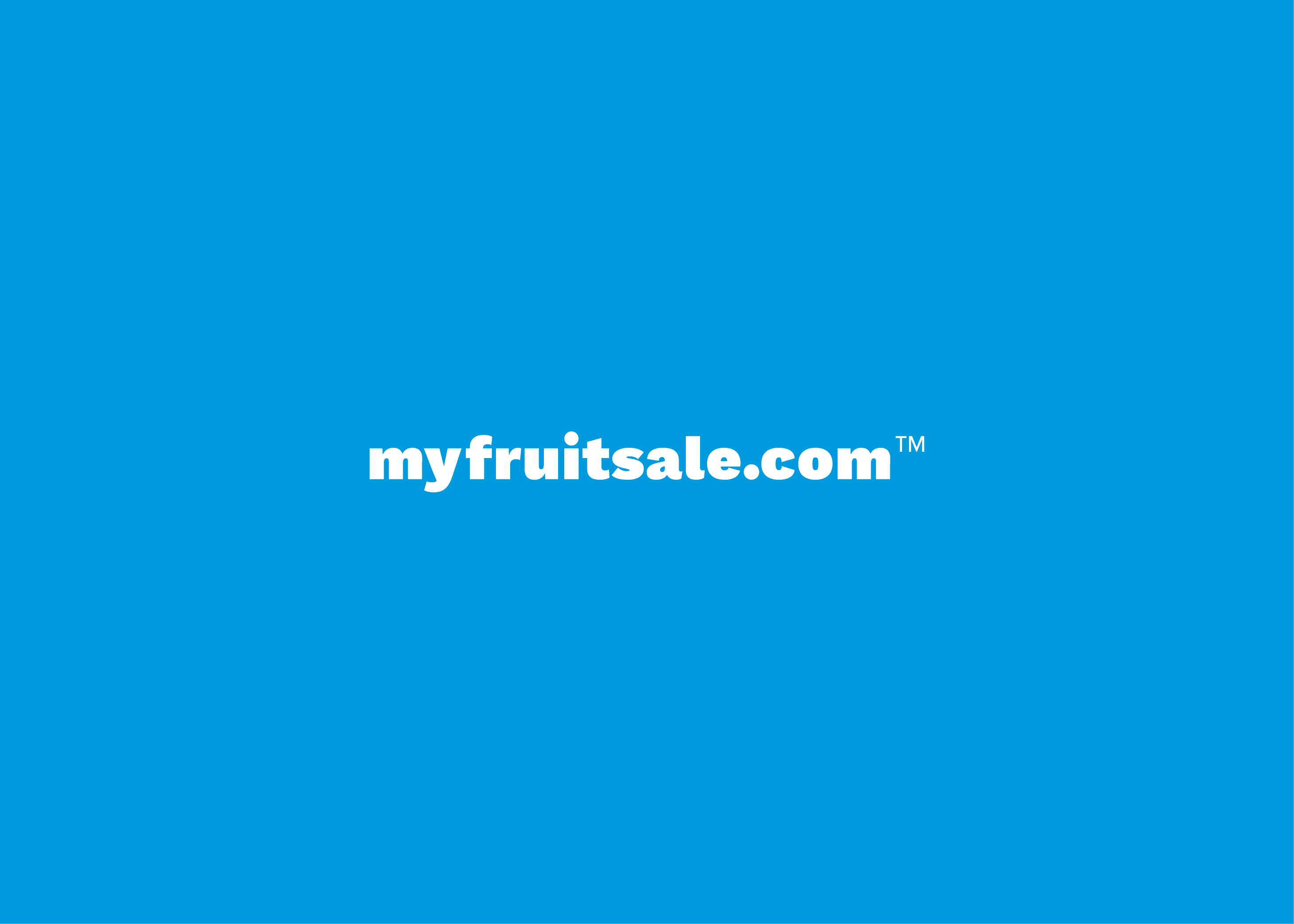
Client: myfruitsale.com
Over the last five years, I have developed and built this brand from the ground up. Through changes in the client's identity and product offerings, this visual identity has evolved and matured into the largest project I have yet undertaken.

Origins
Originally operated as Minntex Citrus, the client provides full-service fundraising programs to youth organizations across the Midwest, featuring fresh fruit and gourmet snacks. Each year, they work with hundreds of organizations during a narrow time frame to plan and execute fundraisers, necessitating a strong brand and memorable service due to their short bursts of contact with customers.

In 2019, the client began a renaming process from the “Minntex Citrus” brand (pictured above) to “myfruitsale.com,” the title of their newly developed online fundraising platform. This platform quickly became the cornerstone of their fundraising program, making a new brand identity essential. Over the ensuing years, I collaborated with them to develop the myfruitsale.com brand.
Goals
The myfruitsale.com brand needed to clearly communicate the client’s services, products, and target customers in a distinct way. Unlike many fundraisers that are complex and time-consuming, the client distinguishes its offering as “simple” and “easy” compared to the competition. To communicate this value, the design approach needed to emphasize cleanliness, with ample space between elements, large blocks of color, and uncomplicated font choices.

Given the client’s forty-year history with its original name and brand, it was important to transition to the “myfruitsale.com” name without confusing existing customers who interacted with the brand only a few times each year. Our solution was a series of “combined” brands that included elements of both the old and new brands, gradually shifting the dominant brand through several iterations from 2020 to 2024.
Design
The new logo features the brand name in a bold, thick font and a blue/green color scheme, accompanied by minimalist icons and bright colors to highlighted the client's values of simplicity and ease of use.
As we continued to refine the design, rounded corners were introduced as the standard style for color blocks and image containers to create a more friendly design language.

To keep the visual style as approachable and uncomplicated as possible, we opted for a clean and simple serif font across the entire brand.


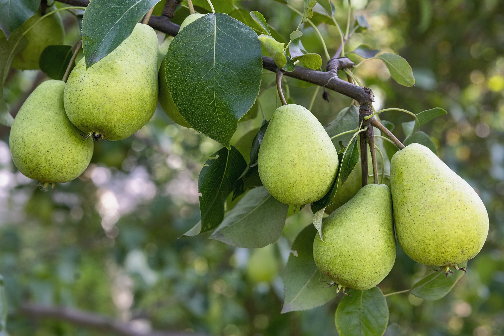
Additionally, high-quality imagery of fresh fruit and bright, playful colors were used to emphasize the client's youth-focused fundraisers.
Results
After several years of iteration and implementation, the client now has a strong visual identity in place for its future. The final brand is clearly defined and organized in a nearly 50-page brand guideline, demonstrating styling parameters for logos, colors, type, photography, and more.
The client has successfully completed it's renaming process, maintaining and growing its position in the market.


Explore.
View Recent Projects


Let's Connect.
Inquire about a project, discuss an opportunity, or connect about design.