Product Packaging.
Client: myfruitsale.com
As a part of an ongoing rebranding project, the client needed to create a new system of standardized packaging across its line of fresh fruit boxes. I worked over several years to create and implement this system for dozens of SKUs.

Origins
Specializing in fresh fruit fundraisers, the client pioneered the “mixed fruit box,” a line of boxes that contained different combinations of fresh fruit, in the 1980s (original packaging pictured below). These products, and their packaging, have since become a key component of the client's brand. Featuring bold blocks of colors, each paired with a popular combination of fruit, they were designed for easy distribution by the school groups and sports teams that sold them.
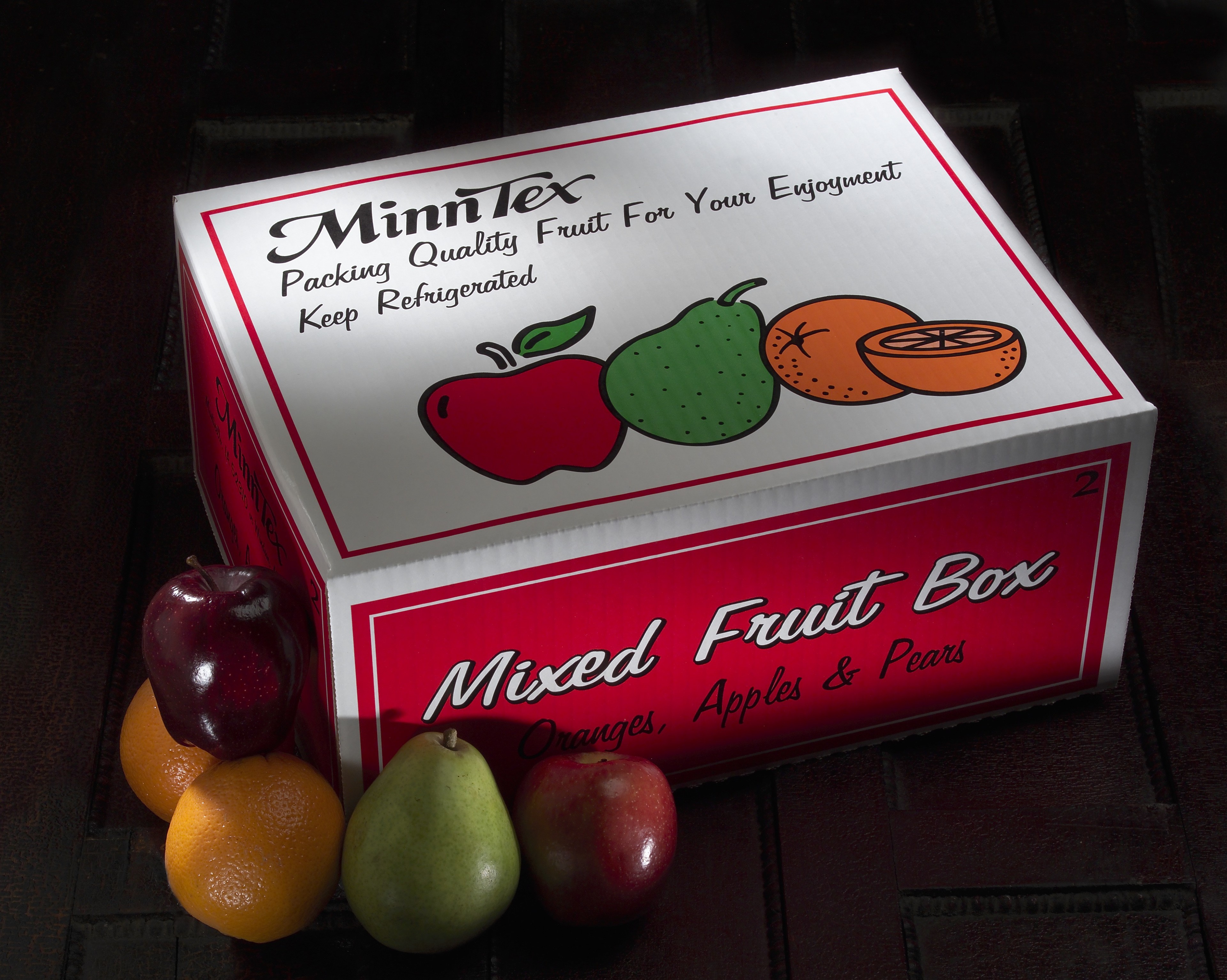
The original design of these boxes, known only by their numbered item codes: #1, #2, #3, #4 and #5, remained unchanged through the 1980s, 90s and early 2000s. However, a redesign circa-2010 gave the boxes a facelift while preserving the block-color scheme (pictured below). This design persisted until the client's rebranding created an opportunity for a third iteration that could embrace this new era.

Goals
These boxes have several important problems to solve for the client's customers. Fundraising groups receive all of their products at once, in bulk, at a central location. They are responsible to sort these items into each supporter's order for final-mile delivery. This sorting process can be error prone, necessitating products with distinct colors and typography to minimize confusion.

The printing process for these boxes limits the flexibility of color. Each hue used adds significant cost, requiring its own custom "plate" that will stamp that color's ink onto each box (sample red and green plates for single box shown above). Reducing the number of color plates for each box results in large cost savings for the client.
Design
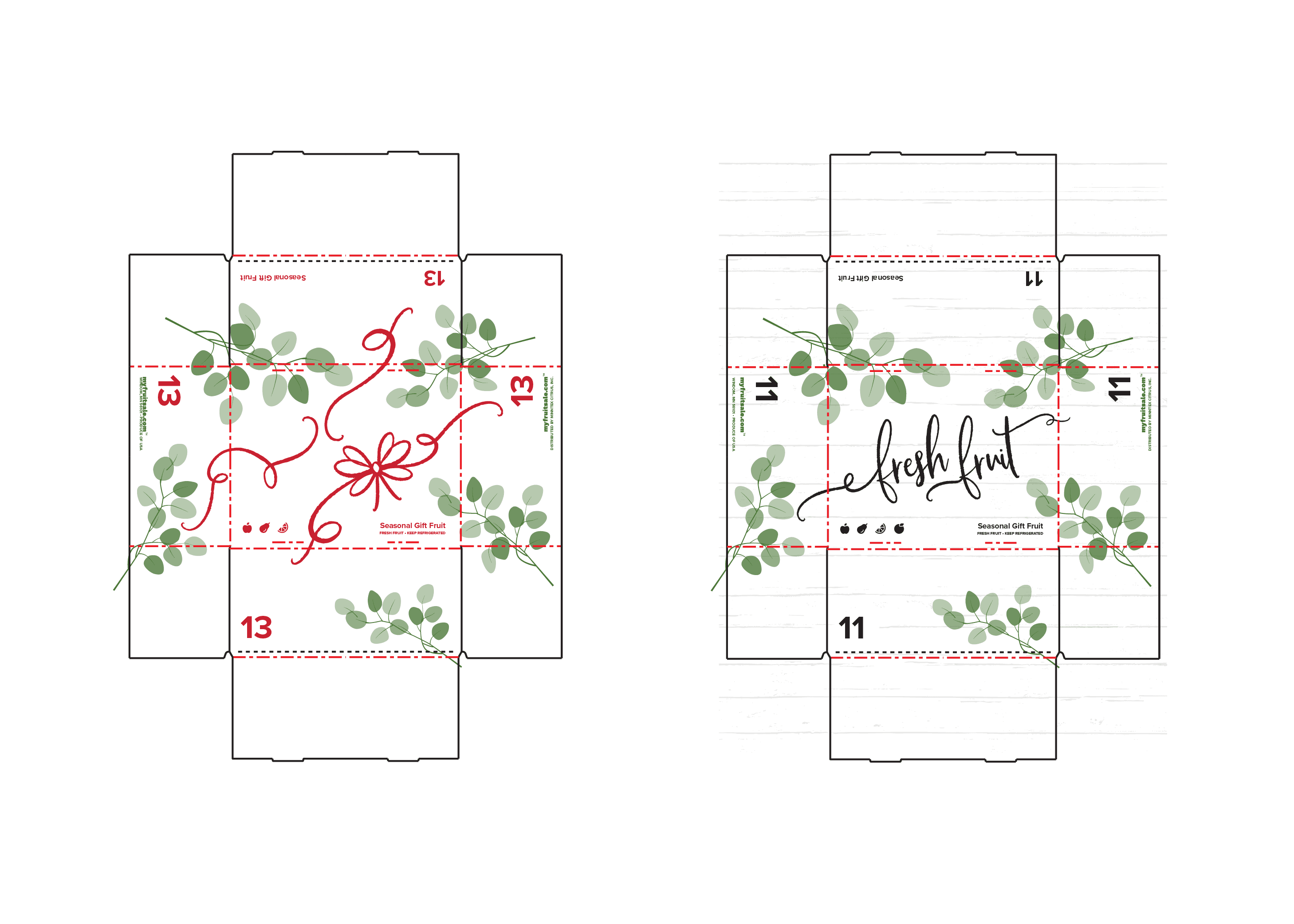
I began with numerous sketches of a central graphic or illustration for each box, but the process quickly shifted to address how to best arrange critical information (box number, box contents, legal disclaimers, box color, etc.) in a way that required only a single unique printing plate per SKU. After talking with the client, we decided to create a system that could also be applied to packaging beyond these five boxes to the entire fresh fruit product line.

The system I created (shown above) involves two stripes of color laid across the box, leaving a large, white gap where an illustration pertaining to the specific product line would sit. The stripes of color would contain all of the information unique to each particular box, necessitating only a single unique plate for each box. The illustration and distribution information would appear on the second plate, that could be shared among every box in a given product line.
Results
The first new boxes with this redesigned system went into use in the fall of 2023, with the final updates rolling out into 2026. In total, there will be almost thirty distinct variations of packaging using this design system, each with their own distinct indices in a consistent layout of information.

The standard #1-5 boxes (shown above) feature their classic colors along with an illustration of leaves from a grove or orchard.
Gift fruit boxes, featuring more premium produce varieties removed the color block but paired the essential information layout system with a more immersive illustration.

Designs for non-mixed boxes of a single fruit variety were created for oranges, grapefruit, apples, pears, and peaches. For products not packaged in-house by the client, we created a series of stickers that could be attached to indicate the item's color and SKU code.


Explore.
View Recent Projects


Let's Connect.
Inquire about a project, discuss an opportunity, or connect about design.