Development
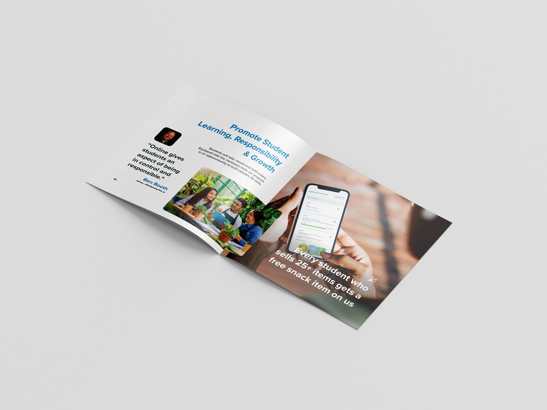
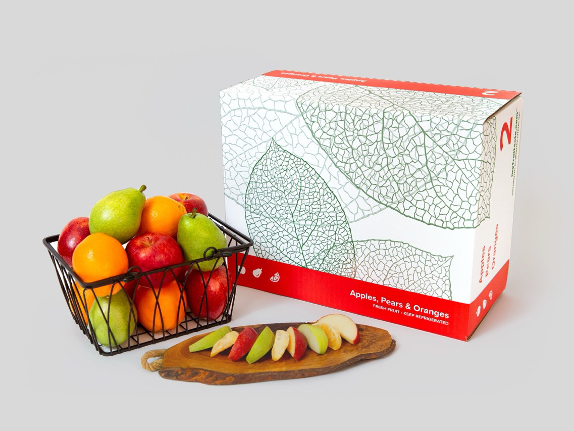
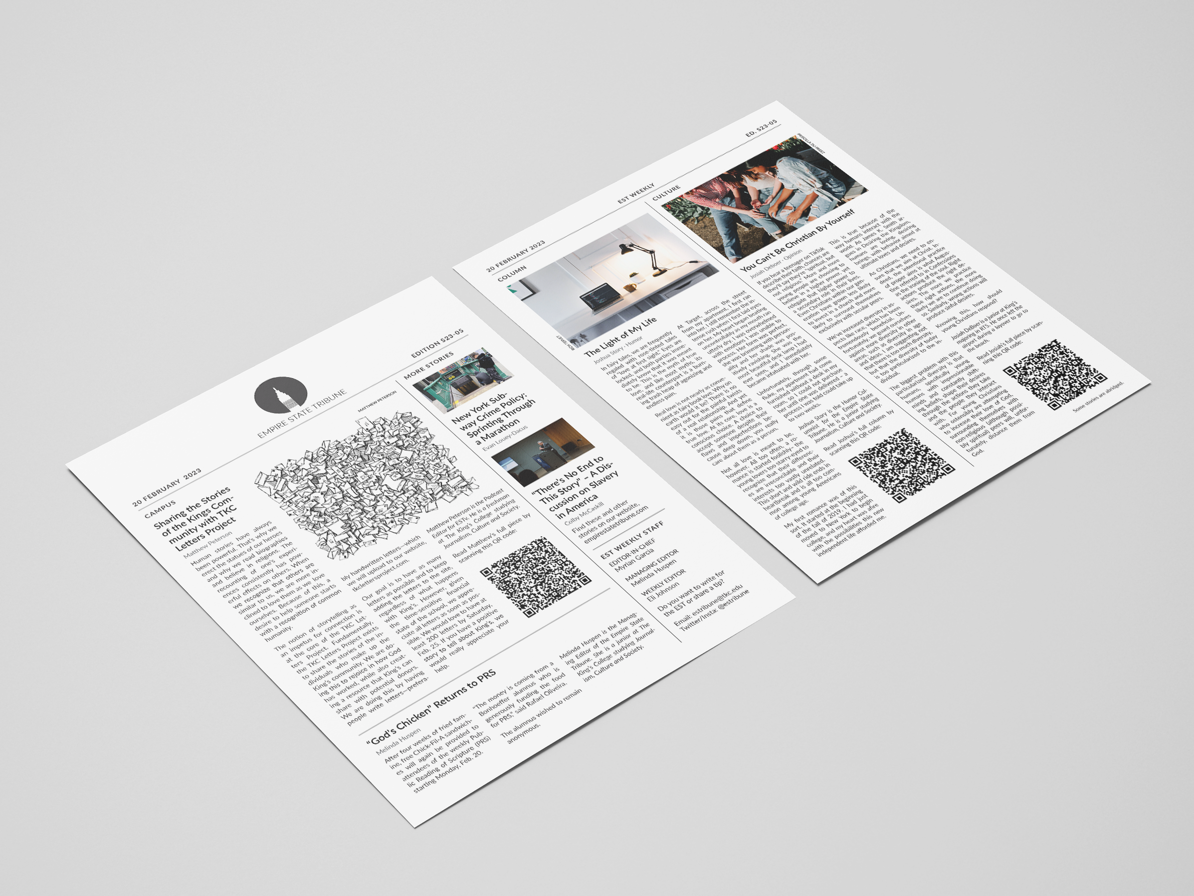
Because this booklet needed to be accessible to a prospective customer engaging only casually with the material, we opted to limit the copy inside as much as possible, relying instead on plentiful photography and illustrations.
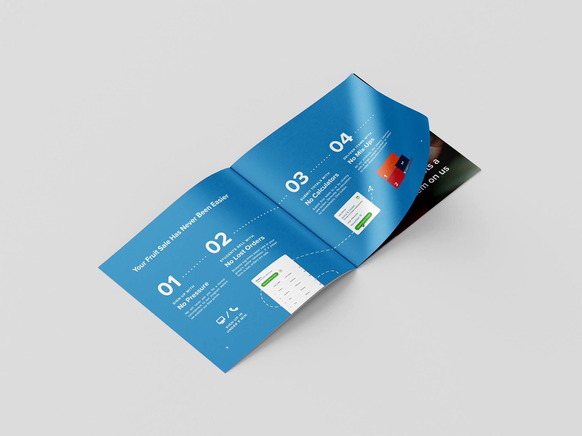
Each page or spread was given a theme, a core category of solutions the client offers to its customers. Once organized in this manner, we could begin piecing together the individual elements required.
Design
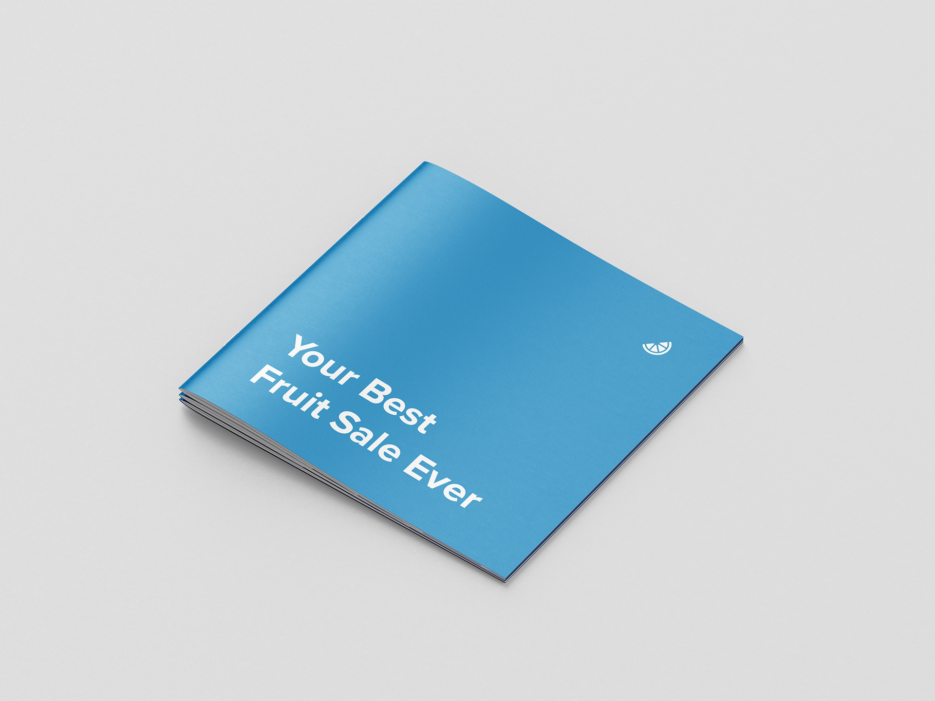
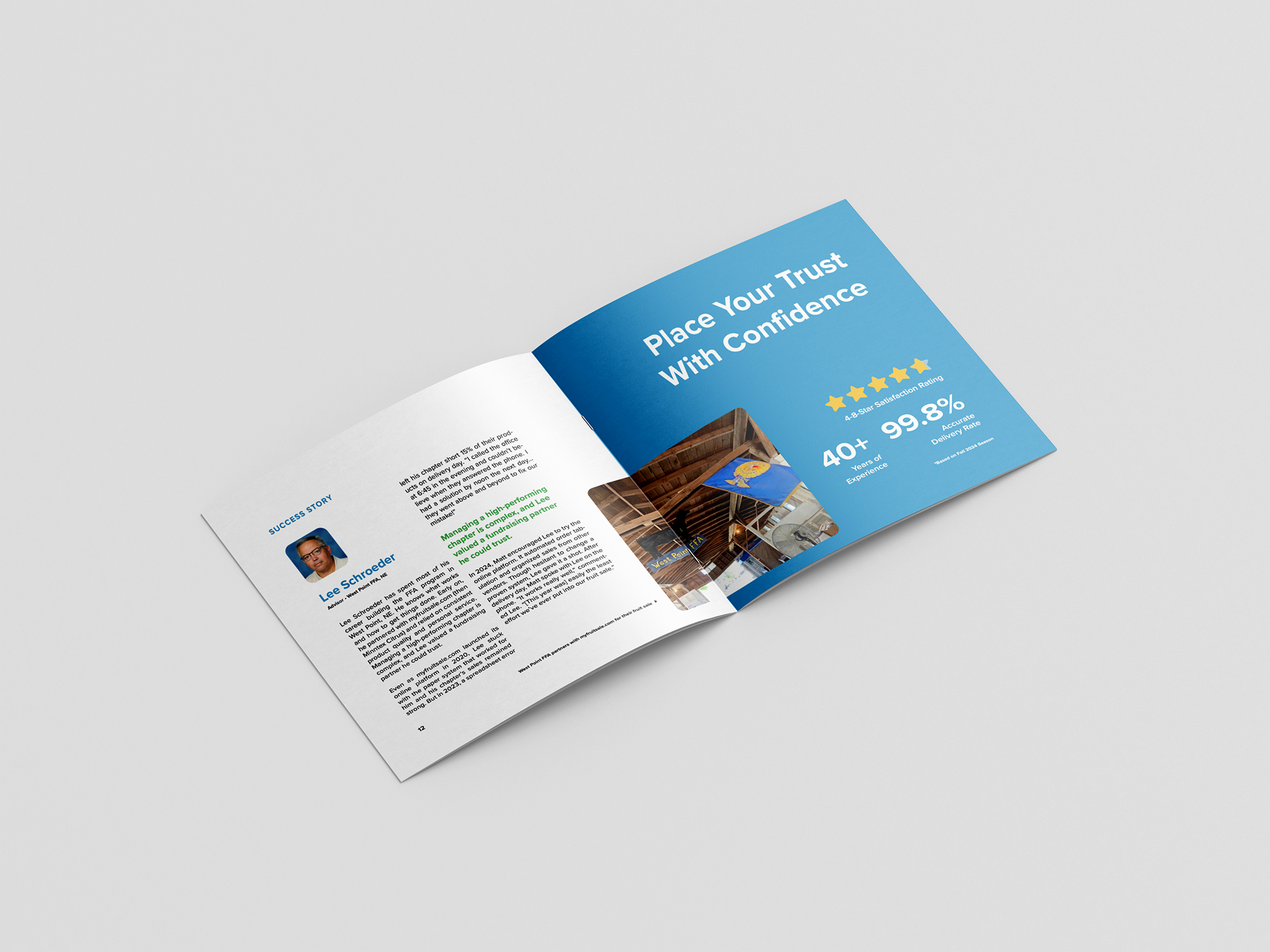
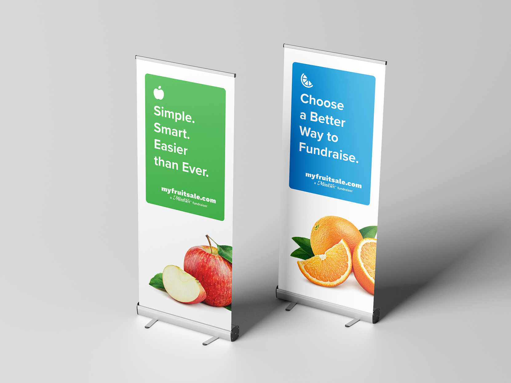
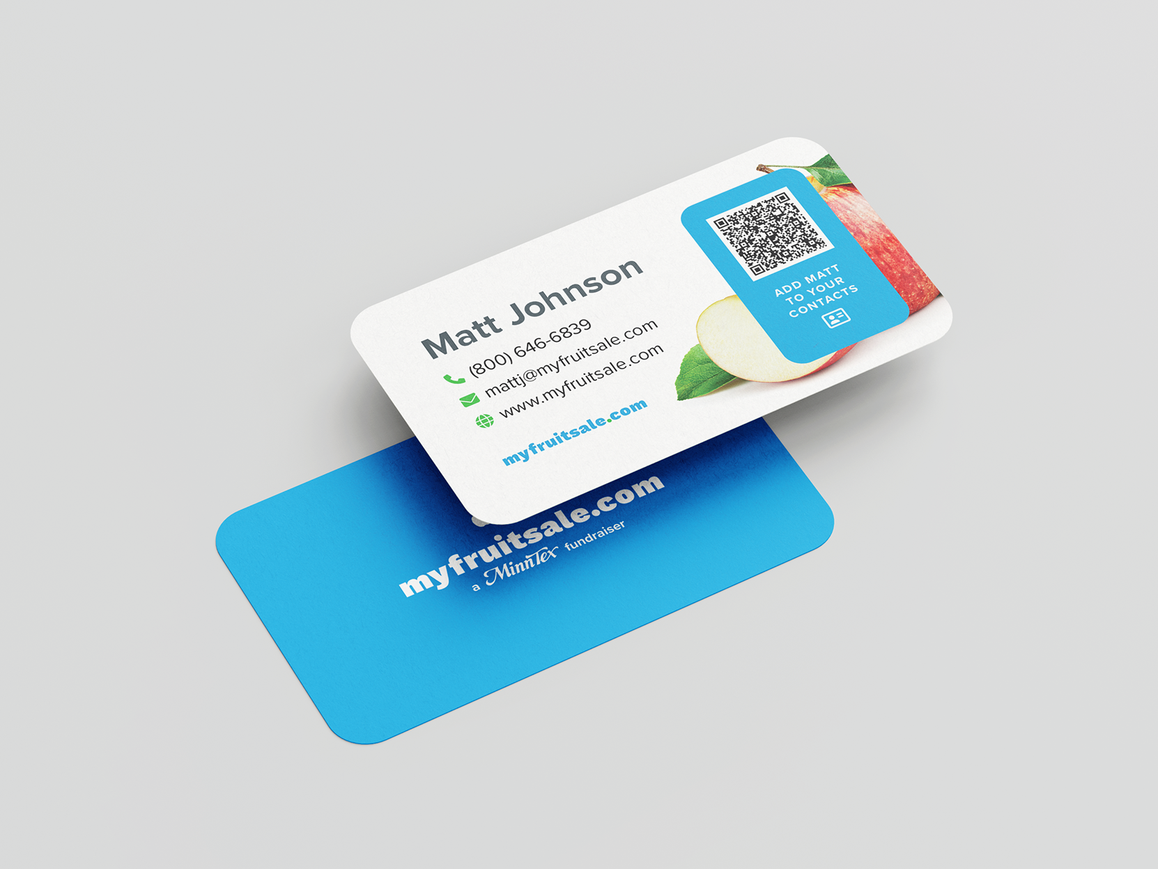
Like the client's visual branding, this booklet features clean sans serif typography, bright blocks of color and ample white space. However, because the size of this booklet (8" by 8") was smaller than most of their marketing assets, we introduced a new element into their visual style.
Whereas images were previously placed in a container with rounded corners, we opted to extend them to a full-bleed layout when they covered a significant portion of the page. This led to more striking and immersive designs, rather than neatly framing and confining our photography.
