History
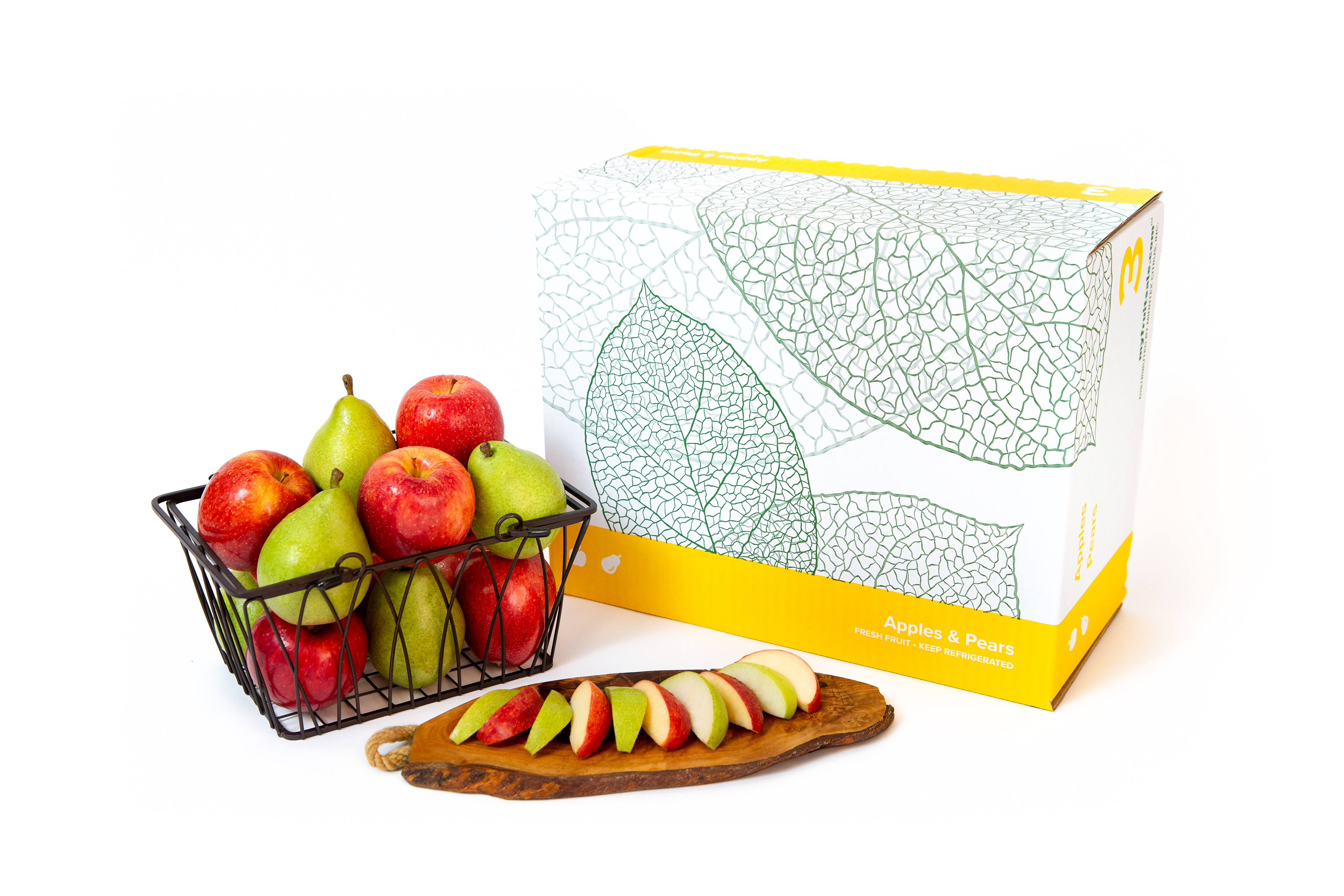
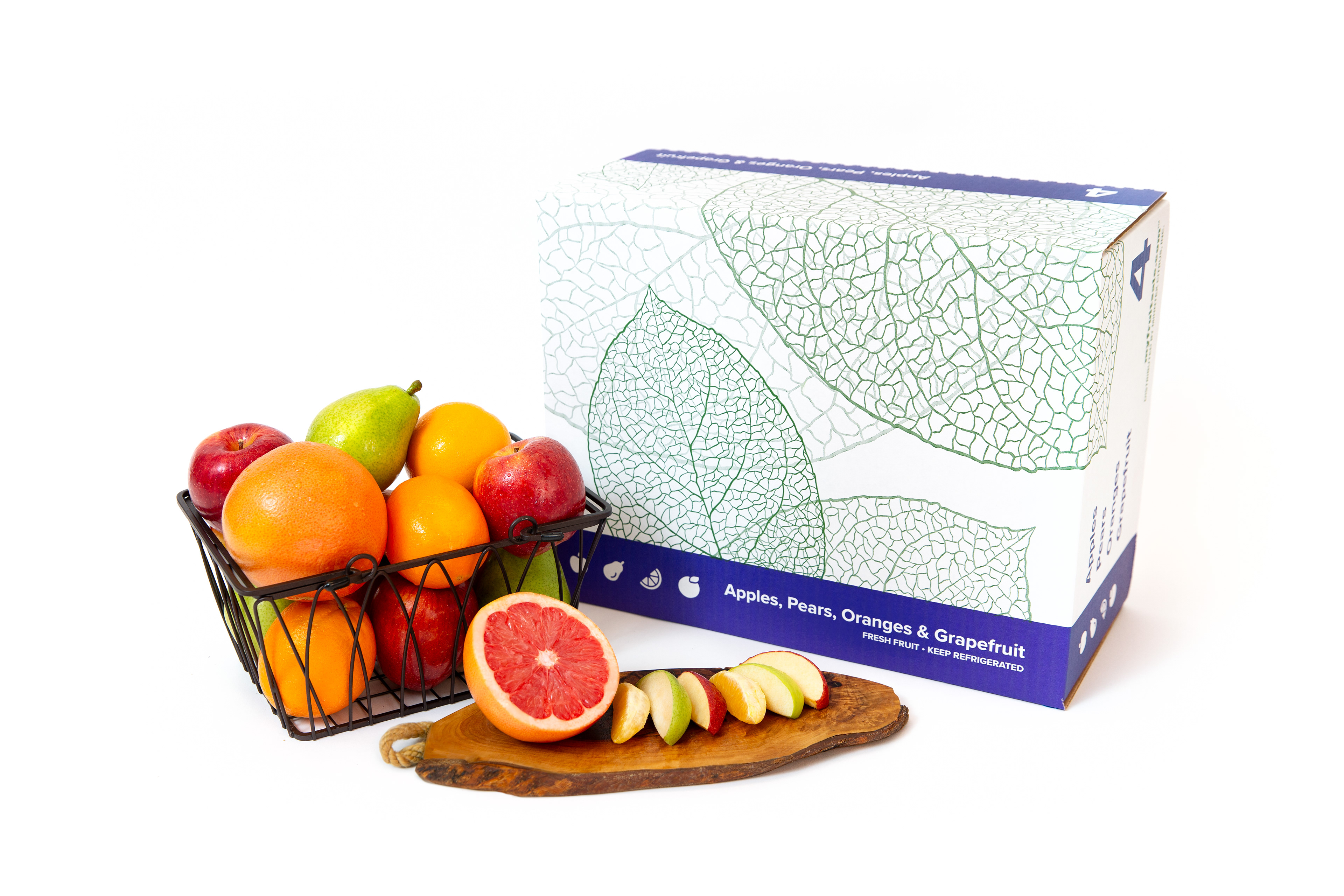
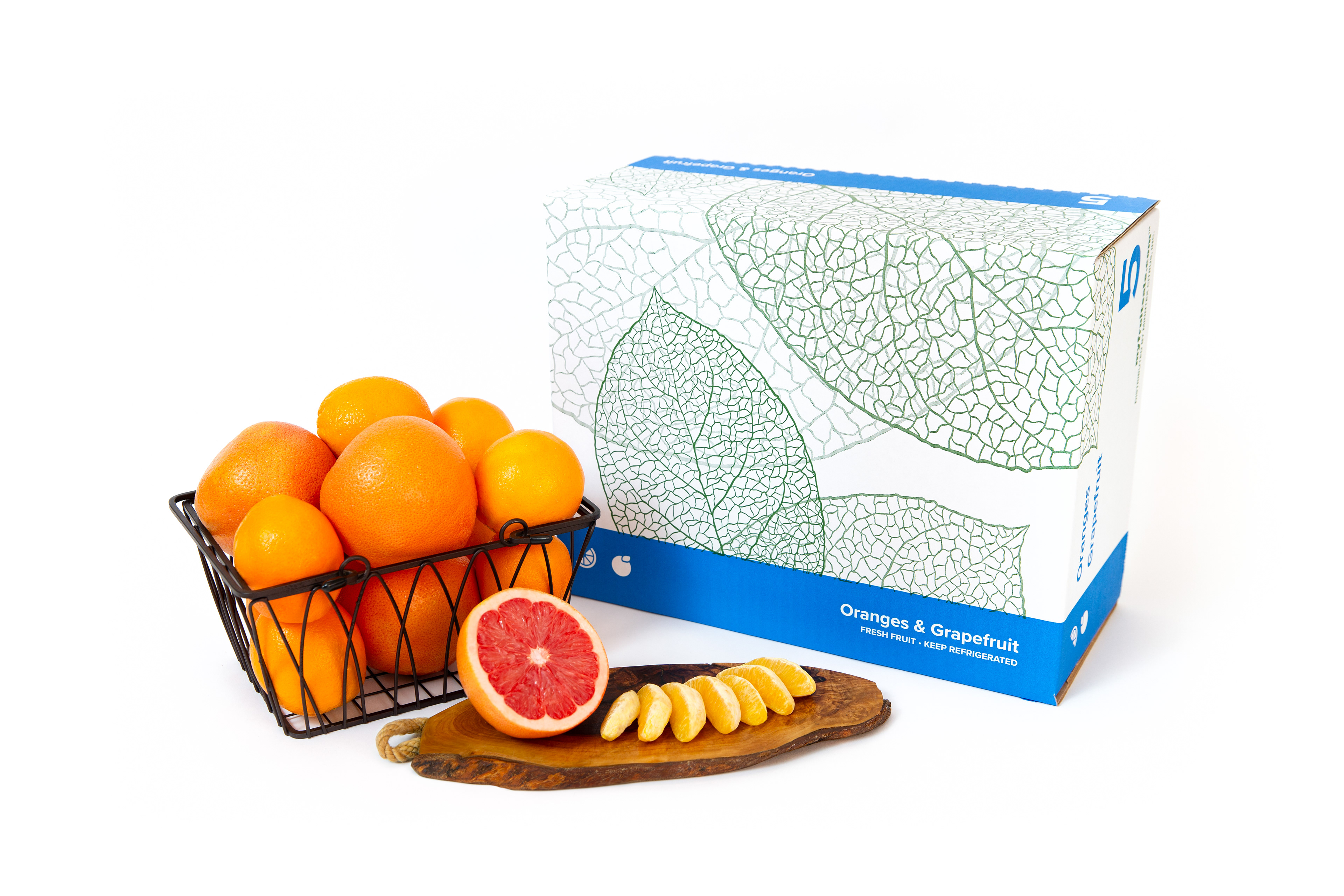
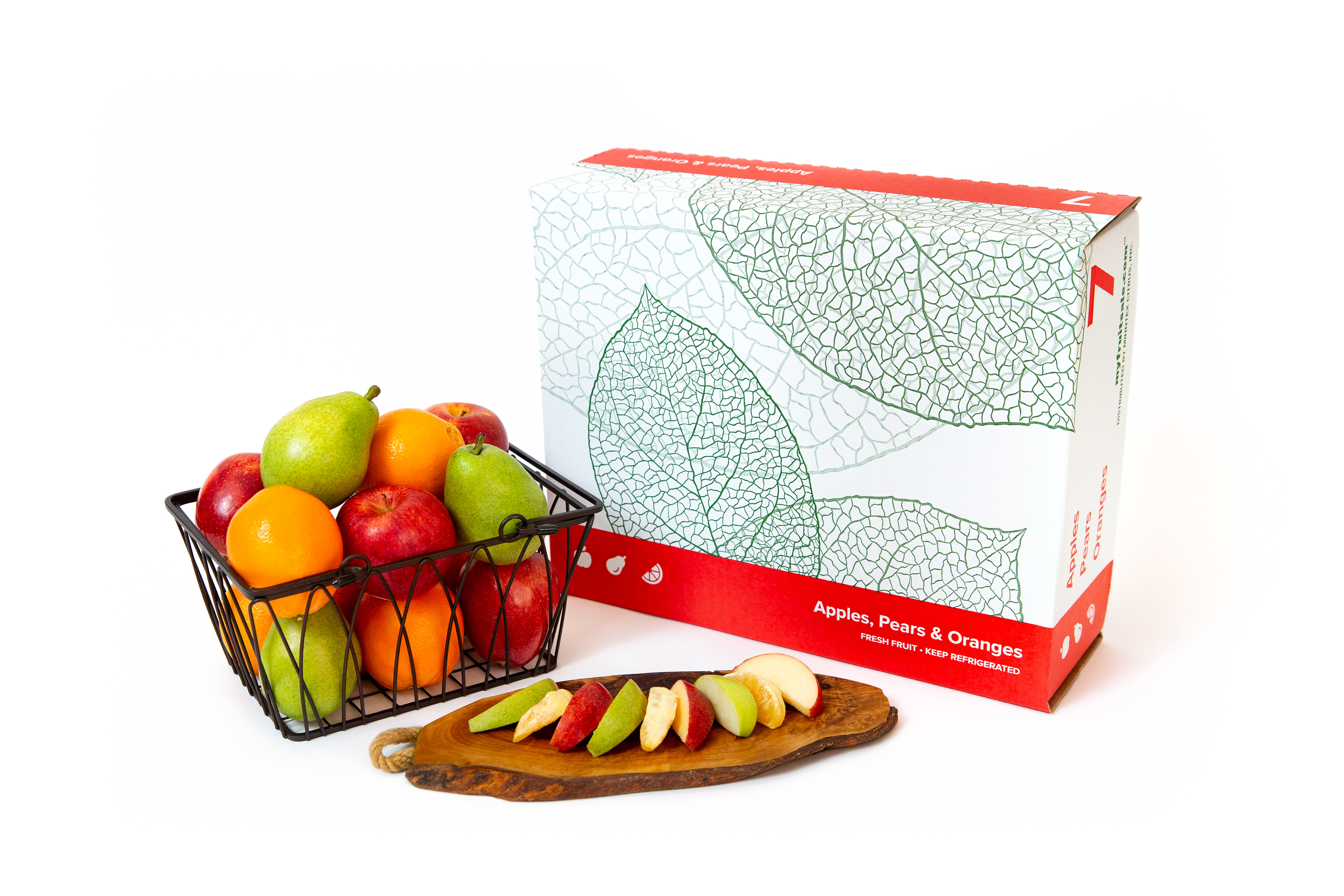
Specializing in fresh fruit fundraisers, the client pioneered the “mixed fruit box,” a line of boxes that contained different combinations of fresh fruit, in the 1980s. These products, and their packaging, have since become a key component of the client's brand. Featuring bold blocks of colors, each paired with a popular combination of fruit, they were designed for easy distribution by the school groups and sports teams that sold them.

The original #2 box design from the 1980s.

The original design of these boxes, known only by their numbered item codes: #1, #2, #3, #4 and #5, remained unchanged through the 1980s, 90s and early 2000s. However, a redesign came to give the boxes a facelift while preserving the block-color scheme. This design persisted through the 2010s, until the client's renaming created an opportunity for a third iteration that could extend across, not just the mixed boxes, but the entire product line.

The design of the #2 box used in the late-2000s and 2010s.

Goals & Challenges
These boxes have several important problems to solve for the client's customers. Fundraising groups receive all of their products at once, in bulk, at a central location. They are responsible to sort these items into each supporter's order for final-mile delivery. This sorting process can be error prone, necessitating distinct colors and typography designed to minimize confusion.
The printing process for these boxes limits the flexibility of color. Each hue used adds significant cost, required its own custom "plate" that will stamp that color's ink onto each box. Reducing the number of colors, or plates, for each box, results in large cost savings for the client.

This red plate and green plate will be printed atop one another to form a completed box.

Design Process
We began with numerous sketches of graphics and illustrations, but primarily the ideas process dealt with how to best arrange the critical information (box number, box contents, legal disclaimers, box color, etc.) in a way that required only a single unique printing plate per box. The new system also had to be adaptable to the packaging in other product lines, both existing and future products.
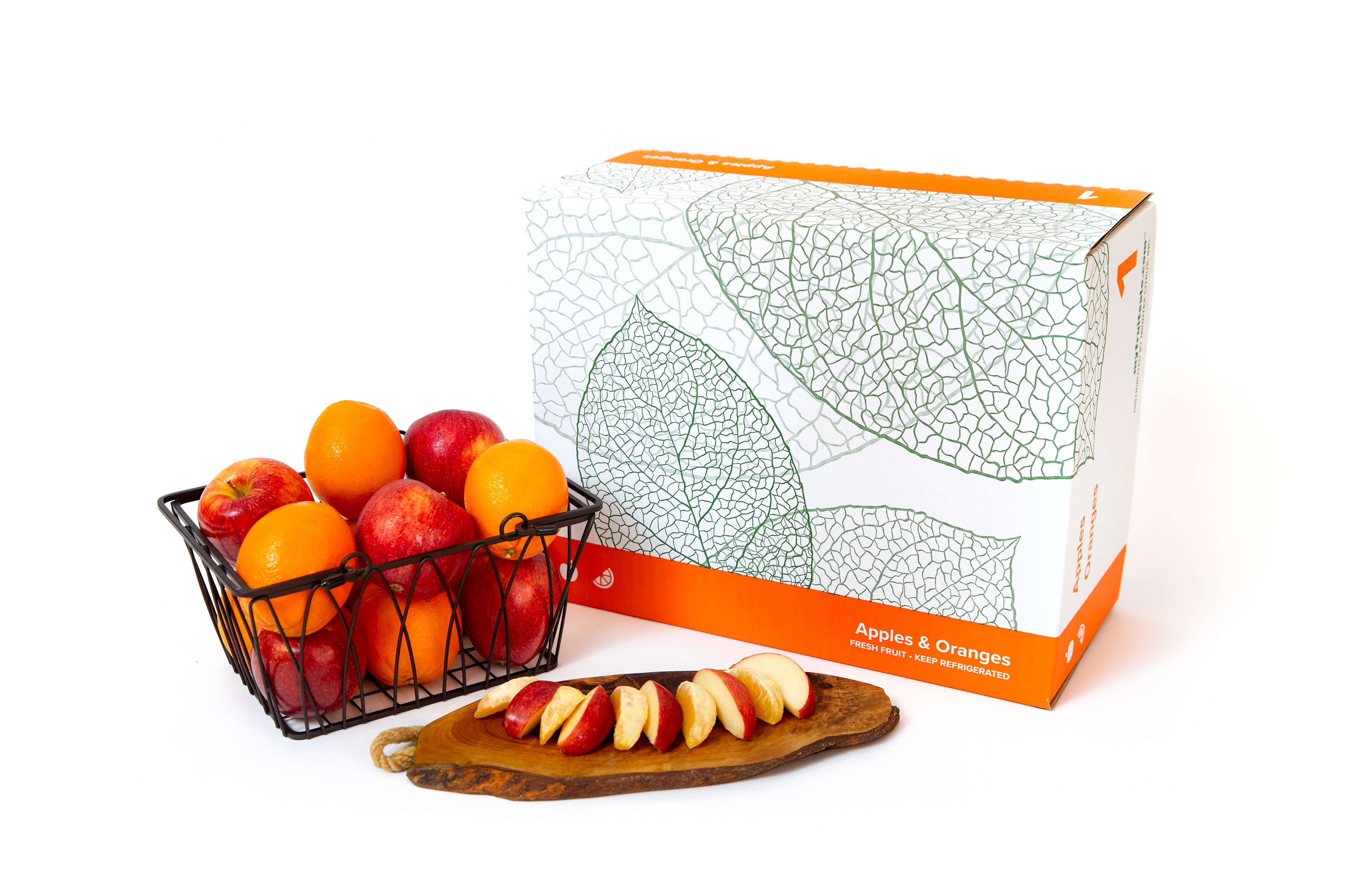
The system that I designed is shown in the image below. It involves two stripes of color laid across the box, leaving a large, white gap where an illustration pertaining to the product line would sit. The stripes of color would contain all of the information unique to each particular box, necessitating only a single unique plate for each box. The illustration and distribution information would appear on the second plate, that could be shared among every box in a given product line.

The final box layout, when folded, will show product information on every side of the box while requiring only a single unique printing plate.

Variations
The first new boxes with this redesigned system went into use in the fall of 2023, with the final updates rolling out in 2025. In total, there will be almost thirty distinct variations of packaging using this design system, each with their own distinct indices in a consistent layout of information.

The new #1 and #4 mixed box designs.

For the apple product line, the illustration in the center was changed to highlight the product.

For the client's line of premium mixed boxes, the colored stripes were removed, but the layout of information remained the same.
The Final Result

More Projects

Back to Top