


The Design Process
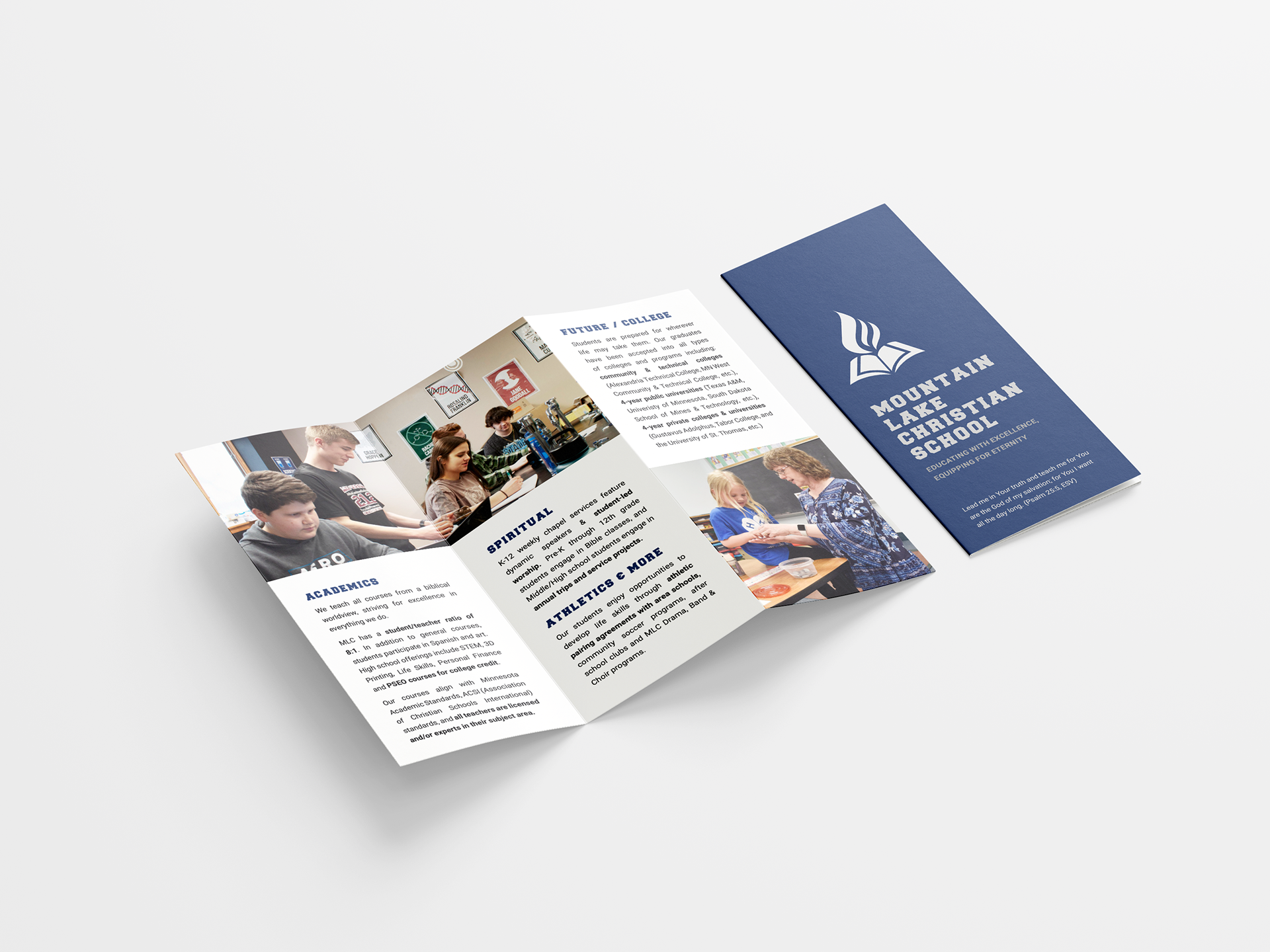
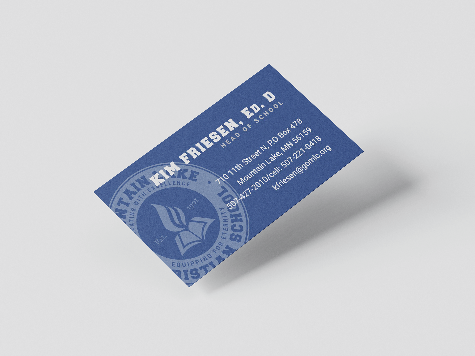
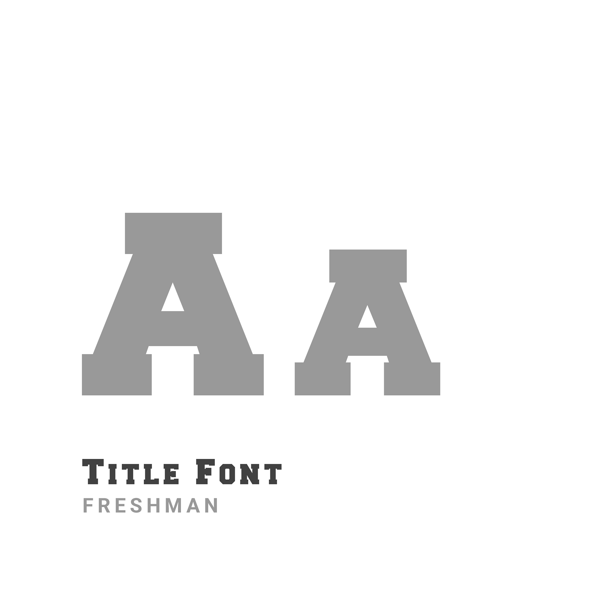
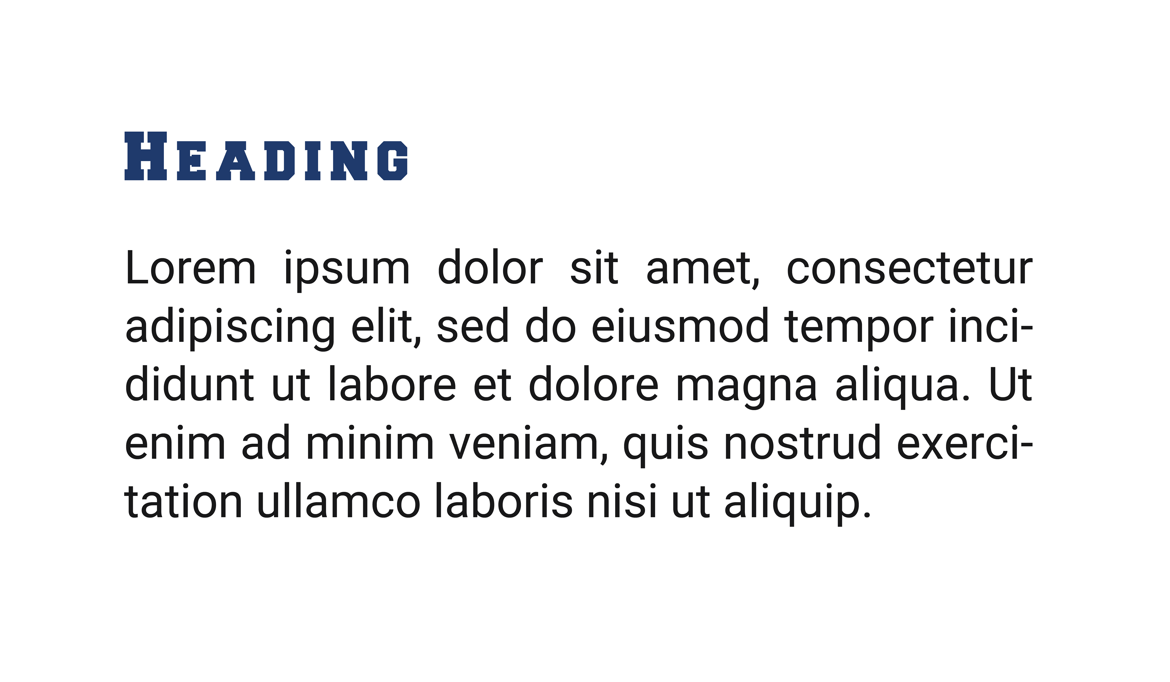
The client's previous visual branding used a dark navy color accented with a saturated tan color. To modernize the palette, we replaced the tan color with a lighter blue, creating a monochromatic palette that still retains an academic theme. Additionally, we introduced a new set of typefaces.
The client's existing logos were mostly retained, although we added a new "seal" variation and a word mark of the client's acronym "MLC."